UX designer in a dev team
What's the point?
Hello!
 Bartosz Mozyrko,
 Product Owner
 Zbyszek Tenerowicz,
 Front-end Developer
Why listen to us?
Cogision
- Independent research & consulting agency
- Over 50 projects for external clients
UsabilityTools
- Toolkit for improving conversion and UX
- Most of the clients: UX agencies
The company evolved from agency to a SaaS business.
At first we were like this

Last 12 months
The job

The scope
The scope
UX Elements? What for?
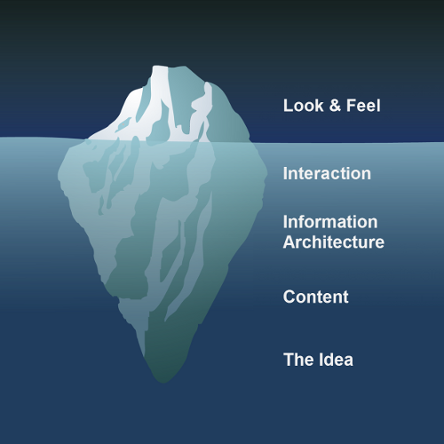
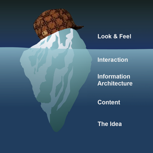
- JJ Garrett`s diagram explains development process in terms of design, technology and business
- The model has been commonly used (and modified) for over a decade!
- Good UX Designers should know how to operate on every level (most people notice only the surface)
- See for yourself: www.jjg.net/elements/pdf/elements.pdf
Know the difference

Good to have & like
Skills you should be looking for
1. Letter T

T-model implies that UX design is a practice overlapping areas of interest of multiple disciplines
T
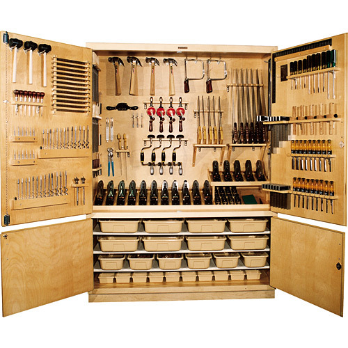
2. Tools
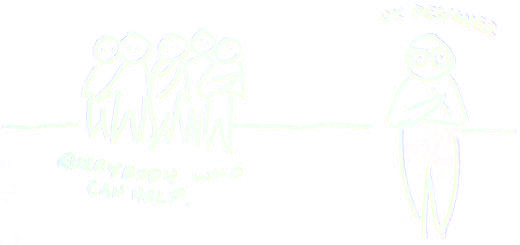
3. Mindset
4. Iterations
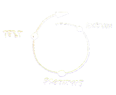
It's not an Iteration if you Only do it Once!
Who UX Designer is not?

Thinking process

- During divergence we are creating choices and during convergence we are making choices
- Ability of analytical thinking (breaking problems apart) and synthesis (putting ideas together) are also essential
It`s all about the money
- UX decreases developement costs and improves customer satisfaction
- Minimum viable research - time is money too, you know

Better
a rough answer to the right question
than
a detailed answer to the wrong question
The job

You are here:

UX bridges the gap between devs and users
How to communicate
- Learn to understand both worlds
- Remember what point of view you represent
AKA why can't a dev be a UX too? - You are responsible for getting everyone to
share the same vision

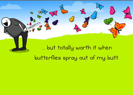
Understanding devs is tough at first
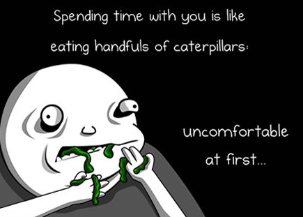
But totally worth it
Communicate the design
This slide is obviously about mockups
A picture is worth a thousand words
- How many of them are true?
- How many of them are intended?
- How many of them are ambiguous
or misleading? - Isn't a thousand a bit too much?
Communicate the design 2
- Where do old mockups go to die?
- Remove variants that were dropped
UpdateReplace mockups with printscreens when implemented- Print out current application state to draw on
- Use printscreens as mockup basis when applicable
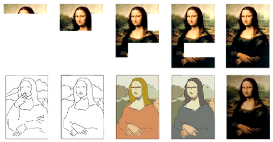
Mockup fidelity
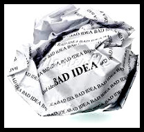
- Draw your ideas like you had all the paper in the world
- If you can't show it on a pencil drawing, you don't know what you mean
- Mockups are not graphics designs without color
High fidelity prototype
- HiFi prototypes for whole-app designs
- It's better to make changes earlier
- Communicate actual interaction
- Best at describing what dynamics you want
- Reveals issues with too much text
Effort centered design ®
value/price ratio
Stop overdoing design

Appreciate when it's finished
Where is effort created?
- Every problem has multiple solutions,
why not choose the easiest? - Know the constraints - know the cost
- Understand technology and the team
- Gather opinions on feasibility,
you'll get more than you expect - Developers' laziness is a virtue ;)
Art of ballancing user needs and business value the UX job is.Master Yoda
Perfect designs are great
...until someone asks "how much?"
UX designer in a team
...is an investment in fixing misconceptions early
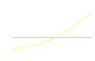
Keeping the effort steady
=
Keeping the spending steady
Coding designer

Learn to code - gain a new superpower!
- Know the constraints and capabilities
- Prototype in highest fidelity
- Prototype responsive layouts
- Work directly with the application
It's getting easier
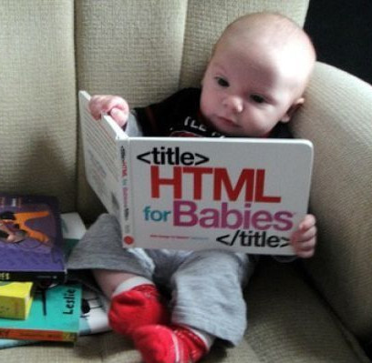
Resources for learning HTML5 and CSS are really nice
Labels
- Usability can be improved by just changing the labels
- Ask your devs, it's easy to change labels yourself
- Do it in the app, not on mockups
- Test it right away!
Designing in the browser
Try ideas on the application itself
What you see is what can be implemented right away
Tools
- FireFox has "developer tools" targeted at designers
- Addons for responsive design testing
- LESSCSS, live refreshers
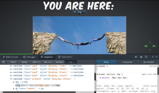
Styleguide
- Make decisions in code!
- Start the project with styleguide
- Devs can make it accessible to you
- You don't need experience to start
contributing to styleguide
.button { border: 1px solid #239ea8; background-color: #14a3e6; }
.button.active { border: 1px solid #000; background-color: yellow; }

.icon-duck { background-image: url('icons/duck.png'); }

.notification { border: 1px solid #000; }
.notification.error { color: red; }
.notification.success { color: lightgreen; }
The end
You can now wake up.
- This silly deck of slides was brought to you by:
Zbyszek "naugtur" Tenerowicz [naugtur.pl]
Bartosz "a na jakim poziomie modelu Garretta jesteśmy?" Mozyrko [mozyrko.pl]
and
UsabilityTools.com - the ultimate online usability toolkit